
The Challenge:
Publimax, a forward-thinking publicity and printing company specializing in large-format outputs like display stands, banners, and billboards, sought a brand identity that would resonate with its innovative spirit and commitment to visibility. The primary challenge was to create a logo and visual system that conveyed professionalism and reliability, yet also expressed creativity, modernity, and the idea of bringing clients' visions to life in a vibrant, impactful way. The brand needed to subtly communicate its core services and dedication to making brands "seen."
Case Study: Publimax Branding
Role: Brand Identity Designer.
The Vision (and the Slogan):
To encapsulate this dual objective of creation and impact, the brand adopted the slogan: "Print Your Vision. Display Your Difference."
This phrase served as a guiding principle, emphasizing Publimax's role in transforming abstract ideas into tangible, commanding visual presences that help clients stand out.
My Approach & Solution:
Conceptualizing the Logo: A Nod to the Craft
The core of the Publimax identity began with a thoughtful exploration of its operational essence. The desire was to create a mark that was both abstract and directly referential to the printing process.
This led to the development of a unique logomark that subtly integrates the letters "P" and "M" while ingeniously evoking the image of a roll of paper being fed into a plotter. The "P" form creates the initial curve of the paper, while the "M" shape suggests the machinery and the unfolding output. This intelligent design allows the logo to symbolize precision, continuous production, and the transformation of raw material into impactful visual communication.
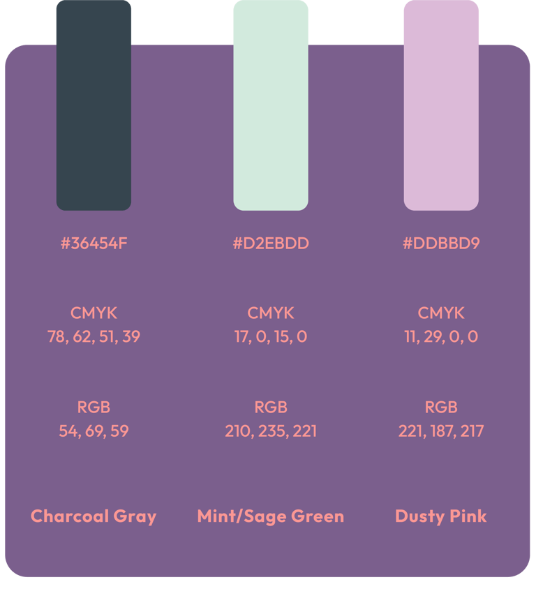
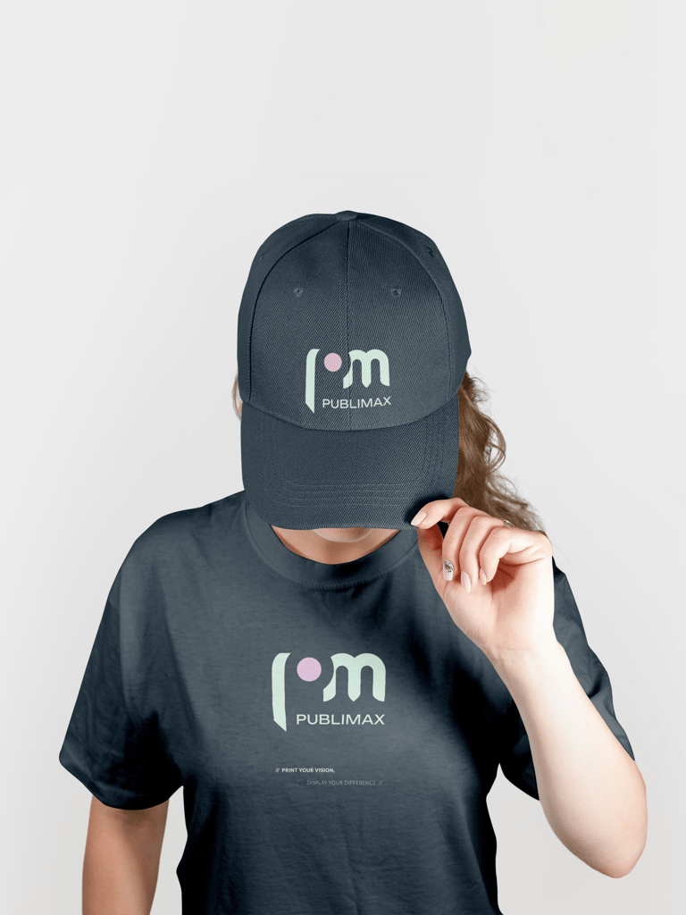
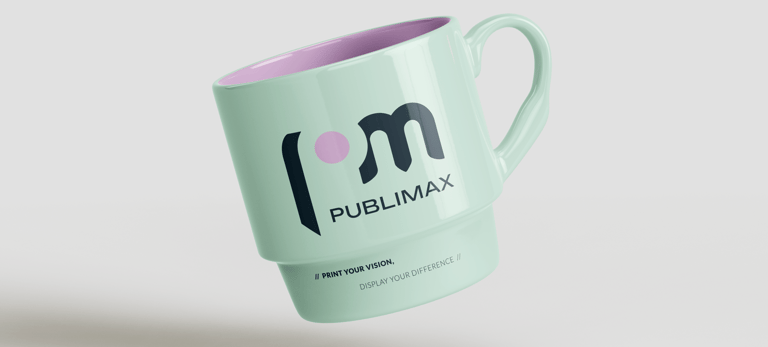
Color Palette: Elegant Freshness
To achieve an "elegant but fresh" aesthetic, a refined color palette was carefully selected:
Primary Background: A deep, sophisticated Charcoal Gray was chosen for its strong foundation, conveying professionalism, stability, and a modern edge.
Key Brand Elements: A soft, muted Mint/Sage Green was applied to the logomark. This color evokes growth, freshness, innovation, and a sense of calm reliability. It provides a vibrant, yet sophisticated contrast against the deep background.
Subtle Accent: A delicate Dusty Pink was introduced as a subtle accent, particularly evident in the dot within the logo. This touch of pink adds a contemporary warmth, approachability, and a hint of creativity without overpowering the overall elegance.
This combination projects a trustworthy yet innovative image, fitting for a company at the intersection of technology and creativity.
Typography: Modern Legibility
The chosen typography complements the clean, modern aesthetic of the logo. A strong, sans-serif BOUNDED ensures excellent legibility and a contemporary feel, while a versatile companion font GILROY maintains readability across all applications. The use of all caps for "PUBLIMAX" in the logo provides a solid, authoritative presence.


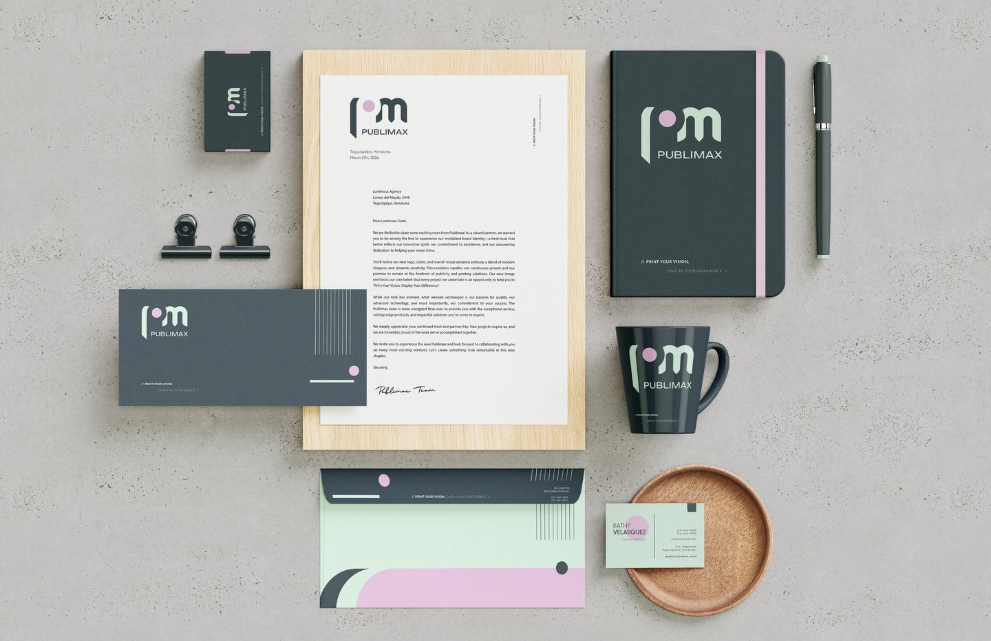
Stationery Kit: Extending the Brand's Reach
To ensure a consistent and professional brand experience, a comprehensive stationery kit was designed. This included:
Letterhead: A clean layout showcasing the logo prominently and subtle integration of brand colors.
Business Card: Designed for immediate impact and memorability.
Envelope: Extending brand recognition to every touchpoint.
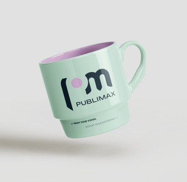
Branded Mug: A practical item that reinforces brand presence in a subtle, everyday manner.
Each item in the kit was meticulously crafted to apply the brand guidelines consistently, reinforcing Publimax's identity with every interaction.Branded Notebook: A complementary element to convey the brand commitment to organization and professionalism.
These guidelines outline the essential elements of the Publimax brand identity, ensuring consistency and effective communication across all platforms. Adhering to these standards helps maintain the integrity and recognition of the Publimax mark.
Publimax Brand Guidelines
Merchandising
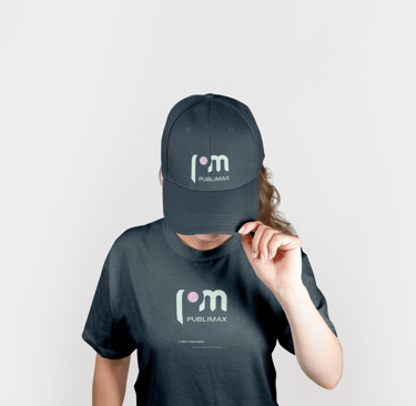
Beyond digital screens and essential print collateral, a robust brand identity extends seamlessly across various merchandise, transforming everyday items into powerful brand ambassadors. For Publimax, translating its innovative and visible identity onto promotional products is a natural extension of its mission to help businesses 'Print Your Vision. Display Your Difference.'


Contact
Let's work together on your next project
info@amelianunezdesign.online
+1 778 558 6791
© 2026. All rights reserved.